Interactive visualization of ephys data
Currently, phy provides two GUIs:
- the Template GUI for KiloSort/SpykingCircus datasets.
- the Kwik GUI for Kwik datasets, obtained with the klusta spike-sorting program (not actively maintained).
These GUIs let you visualize ephys data that has already been spike-sorted. You can also refine the clustering manually if needed. You can also use the GUI as a platform for interactive ephys data analysis. The IPython view lets you interact with the data interactively from within the GUI.
Opening a dataset in the GUI
To open the GUI on a given dataset, you need to use the command-line from the directory containing your dataset.
KiloSort/SpykingCircus
Type phy template-gui params.py in the directory that contains the params.py file.
Usage: phy template-gui [OPTIONS] PARAMS_PATH

  Launch the template GUI on a params.py file.

Options:
  --clear-state / --no-clear-state
                                  Clear the GUI state in `~/.phy/` and in `.phy`.
  --clear-cache / --no-clear-cache
                                  Clear the .phy cache in the data directory.
  --help                          Show this message and exit.
The dataset is made of a set of .npy files (spike_times.npy, spike_clusters.npy, and so on). There are also .tsv files for cluster-dependent data.
The cluster_info.tsv is automatically saved along with your data. It contains all information from the cluster view.
Note: only spike_clusters.npy and TSV files are ever modified by phy. The rest of the data files are open in read-only mode.
Kwik/Klusta
Type phy kwik-gui filename.kwik in the directory that contains the filename.kwik file.
Note: only the filename.kwik file is ever modified by phy.
General presentation of the GUI
Note: we focus here on the template GUI.
The GUI is made of several parts:
- Menu bar (top)
- Toolbar (buttons with icons)
- Dock widgets (main window)
- Cluster view
- Similarity view
- IPython view (optional)
- Many graphical views
- Status bar (bottom)

Dock widgets can be moved anywhere in or outside of the GUI (floating mode). They can be closed as well. New views can be added from the View menu in the menu bar.
Use the menu, keyboard shortcuts, or snippets to trigger actions. Press F1 to see the list of Keyboard shortcuts.
Cluster view
The Cluster view shows the list of all clusters in your dataset.

Cluster selection
You can click on one cluster to select it. Select multiple clusters by keeping Control or Shift pressed. Selected clusters are shown in the different graphical views (detailed below). Clustering actions (merge, split, move, label...) operate on selected clusters.
Select quickly one or several cluster(s) by using snippets: for example, type :c 47 49 to select clusters 47 and 49. See the list of keyboard shortcuts and snippets for more details.

Selected clusters are assigned with a special color: blue for the first selected cluster, red for the second, yellow for the third, etc.
Cluster table
Default columns in the cluster view include the cluster id, best channel (channel with peak waveform amplitude), depth (mostly useful for Neuropixels probes), n_spikes. Click on a column to sort by the corresponding attribute. You can add custom columns (labels, see next page). Use the :s snippet to quickly sort by a given column.
Cluster group
Clusters found by spike sorting algorithms have different qualities. Some are genuine single units, others are mixtures of neurons, others are essentially made of artifacts. For historical reasons, the cluster group is one of:
0:noise(dark grey)1:mua(multi-unit activity, light grey)2:good(green)None: unsorted (white)
Rows in the cluster view are shown in different colors according to the cluster group.
To do: customizable groups and associated colors.
Cluster filtering
You can filter the list of clusters shown in the cluster view, in the filter text box at the top of the cluster view. Type a boolean expression using the column names as variables, and press Enter. Press Escape to clear the filtering. You can also use the :f snippet. The syntax is Javascript. Here are a few examples:
group == 'good': only show good clustersn_spikes > 10000: only show clusters that have more than 10,000 spikesgroup != 'noise' && depth >= 1000: only show non-noise clusters at a depth larger than 1000 ``

Similarity view
The similarity view is very similar to the cluster view. It has an additional column: the similarity. It represents the similarity to clusters selected in the cluster view. As such, its contents change every time the cluster selection changes in the cluster view. By default, clusters in the similarity view are sorted by decreasing similarity.
The similarity score is obtained from the similar_templates.npy file, which is computed by the spike sorting algorithm (e.g. KiloSort).
Graphical views
Graphical views constitute the most important part of the GUI. They represent different aspects of the selected clusters and the corresponding spikes.
Views can be resized, moved around, tabbed in the GUI. You can close views that you don't need, you can add new views. You can also add multiple views of the same type. You can disable automatic updating of any view upon cluster selection.
The view bar is displayed at the top of every view. The view buttons are at the top right of every view, in the view bar. There are buttons to close the view, to make a screenshot of the view (saved in ~/.phy/screenshots), to display the view menu that is specific to every view, and to toggle the automatic update of the view when selecting new clusters

Interactivity in all graphical views:
- Pan: left-click and drag
- Zoom: right-click and drag, mouse wheel
- Reset pan and zoom: double-click
- Increase or decrease scaling: control+wheel (only in some views).
- Histograms: change the range on the x axis
- Waveform, template, trace views: change the y scaling
- Increase or decrease marker scaling: alt+wheel (only in some views).
- Scatter plots: change the marker size
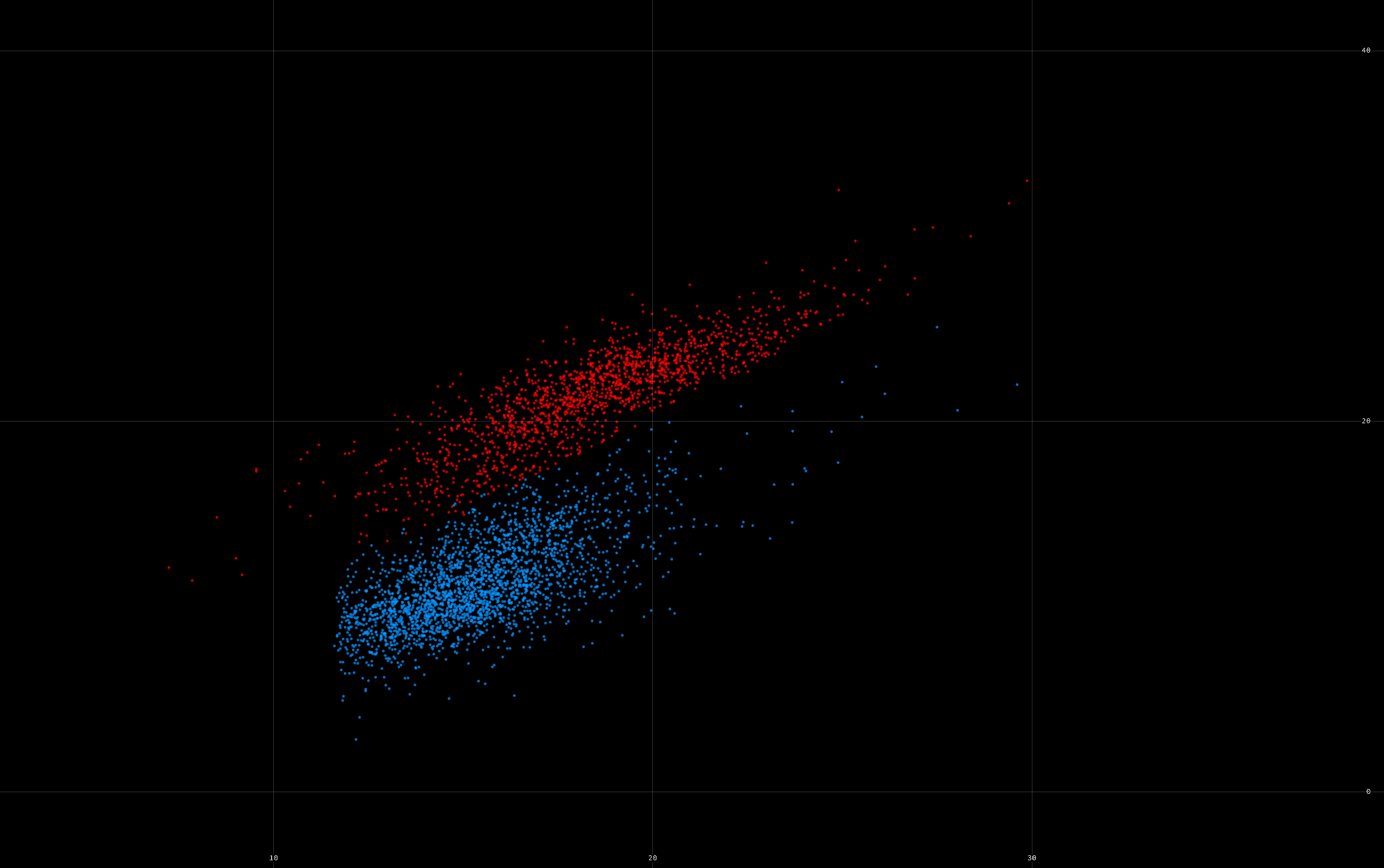
Cluster scatter view
This view shows all clusters in a scatter plot. The x axis, y axis, marker size, and color are computed depending on four customizable fields among the columns in the cluster view. By default, the bindings are as follows:
- x axis: waveform amplitude
- y axis: depth
- marker size: firing rate (log scale)
You can select a cluster by clicking on it, and add a cluster to the selection by shift+clicking on it. You can change the color scheme mapping with shift+wheel. You can select multiple clusters by drawing a lasso with ctrl+click.

Keyboard shortcuts
Keyboard shortcuts for ClusterScatterView

------------------

Keyboard shortcuts
- add_to_lasso                             control+left click
- change_marker_size                       alt+wheel
- clear_lasso                              control+right click
- select_cluster                           click
- select_more                              shift+click
- switch_color_scheme                      shift+wheel

Snippets
- set_size                                 :css
- set_x_axis                               :csx
- set_y_axis                               :csy
Waveform view
This view shows the waveforms of a selection of spikes, on the relevant channels (based on amplitude and proximity to the peak waveform amplitude channel).
The parameter controller.n_spikes_waveforms=100, by default, specifies the maximum number of spikes per cluster to pick for visualization in the waveform view. The parameter controller.batch_size_waveforms=10, by default, specifies the number of batches used to extract the waveforms. Each batch corresponds to a set of successive spikes. The different batch positions are uniformly spaced in time across the entire recording.
You can select a channel with Control+click (this impacts the feature view). You can change the scaling of the channel positions and the waveforms.

You can show: spike waveforms, mean spike waveforms, or template waveforms (toggle_mean_waveforms and toggle_templates actions).
Keyboard shortcuts
Keyboard shortcuts for WaveformView

------------

Keyboard shortcuts
- change_box_size                          ctrl+wheel
- decrease                                 ctrl+down
- extend_horizontally                      shift+right
- extend_vertically                        shift+up
- increase                                 ctrl+up
- narrow                                   ctrl+left
- next_waveforms_type                      w
- previous_waveforms_type                  shift+w
- shrink_horizontally                      shift+left
- shrink_vertically                        shift+down
- toggle_mean_waveforms                    m
- toggle_show_labels                       ctrl+l
- toggle_waveform_overlap                  o
- widen                                    ctrl+right

Snippets
- change_n_spikes_waveforms                :wn
Feature view
This view shows the principal component features of a selection of spikes in the selected clusters, on the relevant channels. The exact channels can be changed by control-clicking in the waveform view. A, B, C... refer to the first, second, third... principal components.
Background spikes from all clusters are shown in grey.
The parameter controller.n_spikes_features=2500, by default, specifies the maximum number of spikes per cluster to pick for visualization in the feature view. The parameter controller.n_spikes_features_background=1000, by default, specifies the maximum number of spikes to pick for the background features. These background spikes are uniformly spaced in time across the entire recording, and across all clusters indistinctively.

The default subplot organization of the feature view is (x,y for each of the 4x4 subplots, 0 refers to first selected channel, 1 refers to second select channel):
time,0A 1A,0A   0B,0A   1B,0A
0A,1A   time,1A 0B,1A   1B,1A
0A,0B   1A,0B   time,0B 1B,0B
0A,1B   1A,1B   0B,1B   time,1B
The documentation provides a plugin example showing how to customize the subplot organization.
Keyboard shortcuts
Keyboard shortcuts for FeatureView

-----------

Keyboard shortcuts
- add_lasso_point                          ctrl+click
- change_marker_size                       alt+wheel
- decrease                                 ctrl+-
- increase                                 ctrl++
- stop_lasso                               ctrl+right click
- toggle_automatic_channel_selection       c
Template feature view
This view is only active when exactly two clusters are selected. It shows the template_features.npy file, which is created by KiloSort.
Keyboard shortcuts
Keyboard shortcuts for ScatterView

-----------

Keyboard shortcuts
- change_marker_size                       alt+wheel
Correlogram view
This view shows the autocorrelograms and cross-correlograms between all pairs of selected clusters.
Subplot at row i, column j, shows the cross-correlogram of selected cluster #i versus cluster #j.
The horizontal line shows the baseline firing rate. Vertical lines show the refractory period, which defaults to 2 ms. You can change it with the view menu or with the :cr snippet.
The parameter controller.n_spikes_correlograms (100,000 by default) specifies the maximum number of spikes across all selected clusters to pick for computation of the cross-correlograms. These spikes are picked randomly.
You can dynamically change the window size and bin size with control+mouse wheel and alt+mouse wheel.
Note: the central peak is artificially removed to avoid artifacts. Decrease the bin size (e.g. to 0.1 ms) if you need to visualize fine temporal structure.

Keyboard shortcuts
Keyboard shortcuts for CorrelogramView

---------------

Keyboard shortcuts
- change_bin_size                          alt+wheel
- change_window_size                       ctrl+wheel

Snippets
- set_bin                                  :cb
- set_refractory_period                    :cr
- set_window                               :cw
Trace view
This view shows the raw data traces across all channels, with spikes from the selected clusters as well. You can also choose to show spikes from all clusters, not just selected clusters.

You can switch the origin (top or bottom) with the alt+o shortcut.
Keyboard shortcuts
Keyboard shortcuts for TraceView

---------

Keyboard shortcuts
- change_trace_size                        ctrl+wheel
- decrease                                 alt+down
- go_left                                  alt+left
- go_right                                 alt+right
- go_to                                    alt+t
- go_to_end                                alt+end
- go_to_next_spike                         alt+pgdown
- go_to_previous_spike                     alt+pgup
- go_to_start                              alt+home
- increase                                 alt+up
- jump_left                                shift+alt+left
- jump_right                               shift+alt+right
- narrow                                   alt++
- navigate                                 alt+wheel
- select_channel_pcA                       shift+left click
- select_channel_pcB                       shift+right click
- select_spike                             ctrl+click
- switch_color_scheme                      shift+wheel
- switch_origin                            alt+o
- toggle_highlighted_spikes                alt+s
- toggle_show_labels                       alt+l
- widen                                    alt+-

Snippets
- go_to                                    :tg
- shift                                    :ts
Trace image view
This minimal trace view shows the raw data traces across all channels as a textured image.

You can switch the origin (top or bottom) with the ctrl+alt+o shortcut.
Keyboard shortcuts
Keyboard shortcuts for TraceImageView

--------------

Keyboard shortcuts
- change_trace_size                        ctrl+wheel
- decrease                                 ctrl+alt+down
- go_left                                  ctrl+alt+left
- go_right                                 ctrl+alt+right
- go_to                                    ctrl+alt+t
- go_to_end                                ctrl+alt+end
- go_to_start                              ctrl+alt+home
- increase                                 ctrl+alt+up
- jump_left                                ctrl+shift+alt+left
- jump_right                               ctrl+shift+alt+right
- narrow                                   ctrl+alt+shift++
- switch_origin                            ctrl+alt+o
- widen                                    ctrl+alt+shift+-

Snippets
- go_to                                    :tig
- shift                                    :tis
Amplitude view
This view shows the amplitude of a selection of spikes belonging to the selected clusters, along with vertical histograms on the right.
NOTE: at the moment, the raw amplitude type is extremely slow as individual spike waveforms need to be fetched on demand from the raw data.

Different types of amplitudes
You can toggle between different types of amplitudes by pressing a:
template: the template amplitudes (stored inamplitudes.npy)raw: the raw spike waveform maximum amplitude on the peak channel (at the moment, extracted on the fly from the raw data file, so this is slow).feature: the spike amplitude on a specific dimension, by default the first PC component on the peak channel. The dimension can be changed from the feature view withcontrol+left click(x axis) andcontrol+right click(y axis).
Number of spikes.
The parameter controller.n_spikes_amplitudes=5000, by default, specifies the maximum number of spikes per cluster to pick for visualization in the amplitude view.
Note: currently, this number is divided by 5 for the raw amplitudes, so as to keep loading delays reasonable.
This view supports splitting like in the feature view. When splitting, all spikes (and not just displayed spikes) are loaded before computing the spikes that belong to the lasso polygon.
Background spikes
Extra spikes beyond those of the selected clusters are shown in gray. These spikes come from clusters whose best channels include the first selected cluster's peak channel. The gray spikes come from all clusters that have some signal on the first selected cluster's peak channel, and not necessarily those for which the best channel corresponds exactly to that channel.
Time range
The time interval currently displayed in the trace view is shown as a vertical yellow bar. You can change the current time range with Alt+click in the amplitude view: that will automatically change the time range in the trace view.
Keyboard shortcuts
Keyboard shortcuts for AmplitudeView

-------------

Keyboard shortcuts
- change_marker_size                       alt+wheel
- next_amplitudes_type                     a
- previous_amplitudes_type                 shift+a
- select_time                              alt+click
- select_x_dim                             shift+left click
- select_y_dim                             shift+right click
Cluster statistics view
This generic view shows histogram related to the selected clusters. Built-in statistics views include:
- Inter-spike intervals (computed using all spikes for the selected clusters)
- Instantenous firing-rate (computed using all spikes for the selected clusters)

Keyboard shortcuts
Keyboard shortcuts for ISIView

-------

Keyboard shortcuts
- change_window_size                       ctrl+wheel

Snippets
- set_bin_size (ms)                        :isib
- set_n_bins                               :isin
- set_x_max (ms)                           :isimax
- set_x_min (ms)                           :isimin
Keyboard shortcuts for FiringRateView

--------------

Keyboard shortcuts
- change_window_size                       ctrl+wheel

Snippets
- set_bin_size (s)                         :frb
- set_n_bins                               :frn
- set_x_max (s)                            :frmax
- set_x_min (s)                            :frmin
Raster view
This view shows a raster plot of all clusters. The order of the rows depends on the sort in the cluster view. If filtering is enabled in the cluster view, only filtered in clusters are shown in the raster view.

Select a cluster with Control+click.
Keyboard shortcuts
Keyboard shortcuts for RasterView

----------

Keyboard shortcuts
- change_marker_size                       alt+wheel
- decrease_marker_size                     ctrl+shift+-
- increase_marker_size                     ctrl+shift++
- select_cluster                           ctrl+click
- select_more                              shift+click
- switch_color_scheme                      shift+wheel
Template view
This view shows all templates. The position of the templates depends on the sort in the cluster view. If filtering is enabled in the cluster view, only filtered in clusters are shown in the template view.

Select a cluster with Control+click.
Keyboard shortcuts
Keyboard shortcuts for TemplateView

------------

Keyboard shortcuts
- change_template_size                     ctrl+wheel
- decrease                                 ctrl+alt+-
- increase                                 ctrl+alt++
- select_cluster                           ctrl+click
- select_more                              shift+click
- switch_color_scheme                      shift+wheel
Spike attribute view
A spike attribute view is a view automatically created for every spike_somename.npy file in the data directory, that contains as many 1D or 2D points as spikes. In other words, the array shape should be (n_spikes,) or (n_spikes, 2):
- 1D array: the view shows time (x axis) versus the value (y axis) for every spike
- 2D array: the view shows the (x, y) values for every spike
In the following screenshot, a spike_hello.npy array containing sin(spike_time) was saved, and a SpikeHelloView was automatically created:

You can split clusters by drawing polygons in the spike attribute views, as in the feature, amplitude, and template feature views.
Keyboard shortcuts
Keyboard shortcuts for ScatterView

-----------

Keyboard shortcuts
- change_marker_size                       alt+wheel
IPython view
The IPython view is an interactive IPython console that runs in the GUI's process. It lets you interact with the data and the GUI interactively.
For convenience, the following variables are available in the GUI:
m: theTemplateModelinstance that represents the dataset.c: theTemplateControllerinstance that links the model to the views.s: theSupervisorinstance that handles the cluster and similarity views, the cluster assignments, the clustering actions, etc. The clustering process by itself (which spikes are assigned to which clusters) is managed bys.clustering, aClusteringinstance.

You can use matplotlib to make quick plots in the IPython view, although it is better to write a custom view properly if you need to reuse it (see the developer section in this documentation).
Color schemes
Some views come with a set of color schemes that attributes a color to each cluster (independently on whether it is selected or not), depending on some of its attributes like its depth, amplitude, firing rate, etc.
The default color schemes are:
- blank: uniform color for all clusters
- random: random color for each cluster
- cluster_group: good clusters are in green, others are in different levels of gray
- depth: the cluster color depends on the probe depth
- firing_rate: the cluster color depends on the firing rate
A color scheme is defined by:
- a name,
- a function
cluster_id => valuethat assigns a scalar value to every cluster. The value is then transformed into a color via the colormap, - a colormap, either the name of one of the builtin colormaps (see below), or a
N*3array, - (optional) categorical, a boolean indicating whether the color map is categorical (one value = one color), or continuous (interpolation)
- (optional) logarithmic, a boolean indicating wwhether the values used to compute the color map should be logarithmically transformed.
The builtin colormaps are:
- blank: uniform gray color
- default: color of the selected clusters
- cluster_group: green for good clusters, different levels of gray for the other groups
- categorical:
glasbey_bw_minc_20_minl_30(one different color per categorical value) - rainbow:
rainbow_bgyr_35_85_c73 - linear:
linear_wyor_100_45_c55 - diverging:
diverging_linear_bjy_30_90_c45
phy uses the colorcet library to define the colormaps. You can also use it to define other colorcet colormaps, or define brand new colormap arrays.
You can write a plugin to define your own color schemes.